
Looking for Valuant? You are in the right place!

Valuant is now Abrigo, giving you a single source to Manage Risk and Drive Growth

Make yourself at home – we hope you enjoy your new web experience.

Looking for DiCOM? You are in the right place!

DiCOM Software is now part of Abrigo, giving you a single source to Manage Risk and Drive Growth. Make yourself at home – we hope you enjoy your new web experience.

5 Critical lender dashboards & reports for credit leaders

Zach Langley
September 7, 2023
Read Time: 0 min

Adapt to a dynamic banking environment with real-time lending & credit data

Lender dashboards and reports showing the lending pipeline, pricing trends, emerging risks, workflow bottlenecks, etc. help financial institutions adapt quickly to trends.

You might also like this on-demand webinar, "Identifying emerging CRE risks."

WATCH NOW


Banking intellligence

Accessing lending/credit data for insights

In the world of lending, where fortune favors the informed, one of a financial institution’s most crucial assets is the data at its disposal. Having dashboards or banking management reports that show the lending pipeline, pricing trends, emerging risks, workflow bottlenecks, and other factors affecting loan growth can help a bank or credit union stay on top of and adapt quickly to trends. The institution can more easily capitalize on opportunities and avoid unnecessary risk.

Ironically, data for making lending and credit decisions for the financial institution can also be one of the toughest assets to harness.

Separate and unconnected sources of lending and credit data, lack of technical resources, and simply overwhelming amounts of information are common barriers to creating lender dashboards or credit overviews. They can result in sub-optimal lending for community banks and credit unions as well as the communities they serve across the country.

The best banking intelligence is your data

A banking intelligence solution that brings financial institution data together in one platform can make it easier to:

  • Visualize data
  • Streamline reporting
  • Make timely decisions.

Natural language search capabilities powered by AI and GPT-3 help bankers find the information they need by using the words they speak every day.

Another hurdle for financial institutions can be identifying key reports that can help make more informed decisions. With the amount of data an institution has at its fingertips, it can be hard to determine what’s relevant and how to apply it for the most effective reporting and analysis.

Learn how to tap your data to generate management insights. Explore Abrigo Connect.

keep me informed Learn more about Abrigo Connect

Deciding report types

Which credit & lending dashboards are best?

Another hurdle for financial institutions can be identifying key reports that can help make more informed decisions. With the amount of data an institution has at its fingertips, it can be hard to determine what’s relevant and how to apply it for the most effective reporting and analysis.

Credit union and bank advisory services are excellent resources on this front. They can initially set up reports to meet a specific institution’s needs and provide credit and lending dashboard examples. They can also provide regular reporting on a variety of metrics for financial institutions lacking technical or human resources.

This blog post explores examples of five key reports to provide financial institutions with insight into their credit and lending processes and their portfolios.

Once lending or credit leaders have these dashboards available, they can answer board or executive questions such as:

  • Can my balance sheet support funding projected loan demand?
  • What are the credit trends in our portfolio and market?
  • How is the quality of loans tied to a recently introduced credit product? Are we generating the returns we targeted?
  • How are our portfolio concentrations trending?

  • How efficient are we by loan type and team member?
  • What’s causing the bottlenecks in our lending processes?

You can also visualize your loan portfolio by product, state, and FICO Score. Watch this video to learn more.

Understanding concentrations

Portfolio insight

5 Dashboards for lending & credit leaders

Credit analytics – Credit migration

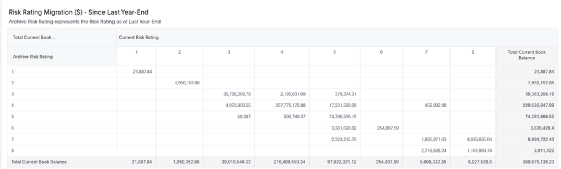
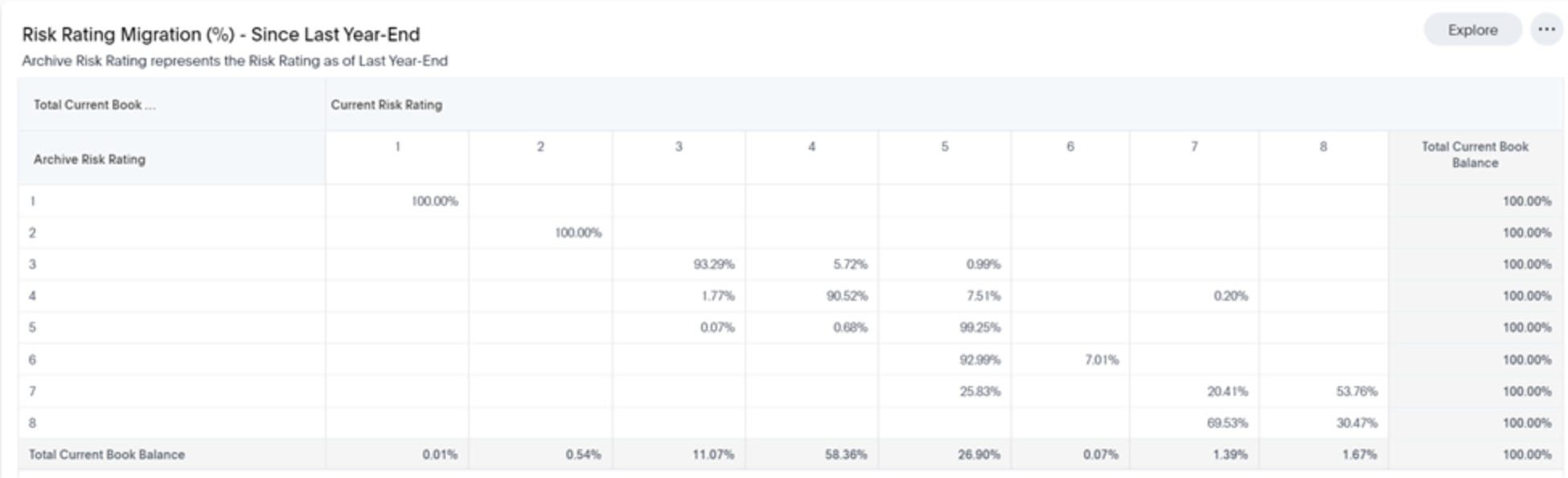
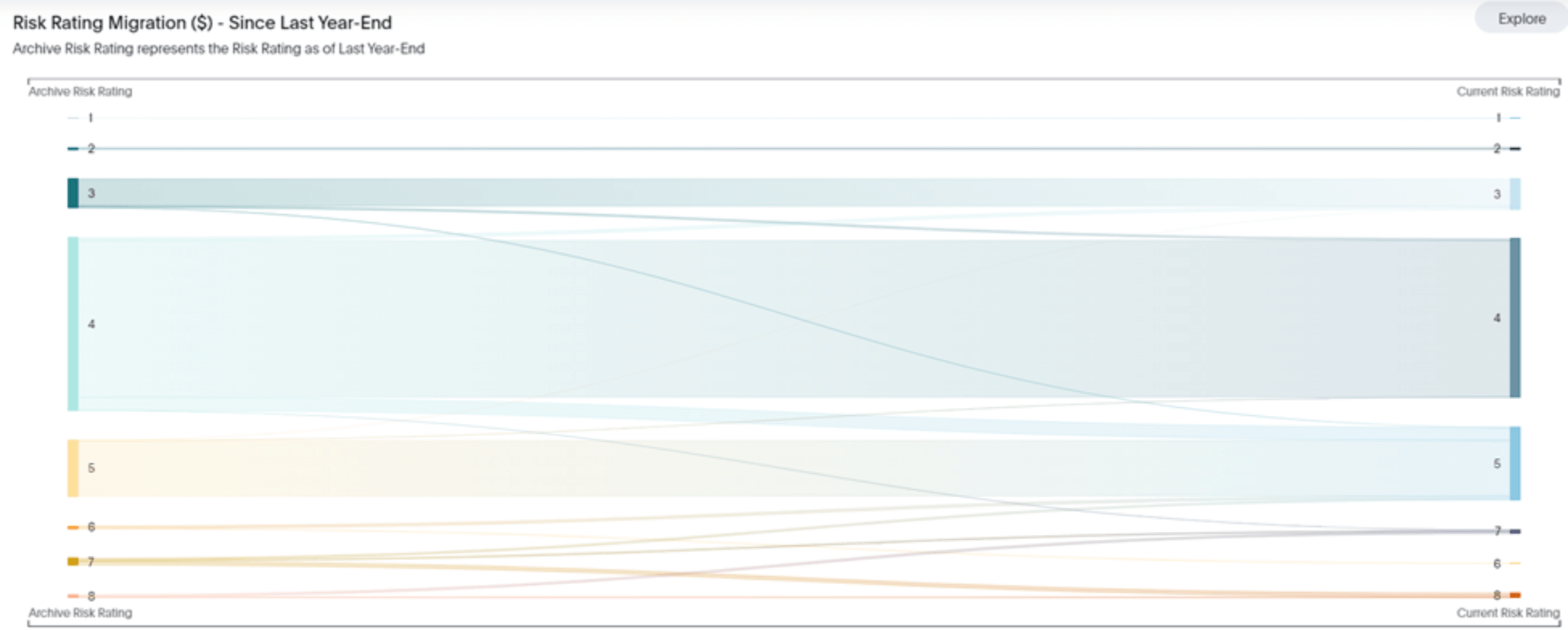
Trending migrations within a credit risk indicator can help an institution identify if the portfolio or a certain market or product is starting to trend in a riskier direction. It provides a glimpse of portfolio credit health and can aid credit monitoring.

When we say migration, we mean isolating a credit risk indicator of loans as of a point in history (last month-end, quarter-end, year-end, 12 months ago, etc.) and then observing where the balance or count of loans have moved in terms of the credit risk indicator.

Below is an example of a risk rating migration that observes migration of balances as of last year-end (“Archive Risk Rating”) to current (“Current Risk Rating”). The migration is shown as absolute balances and as a percent of the risk rating in the charts below. A visual to help conceptualize the migration is also shown.

lender dashboard showing risk rating migration in dollars

graphic depiction of risk rating migration of loans

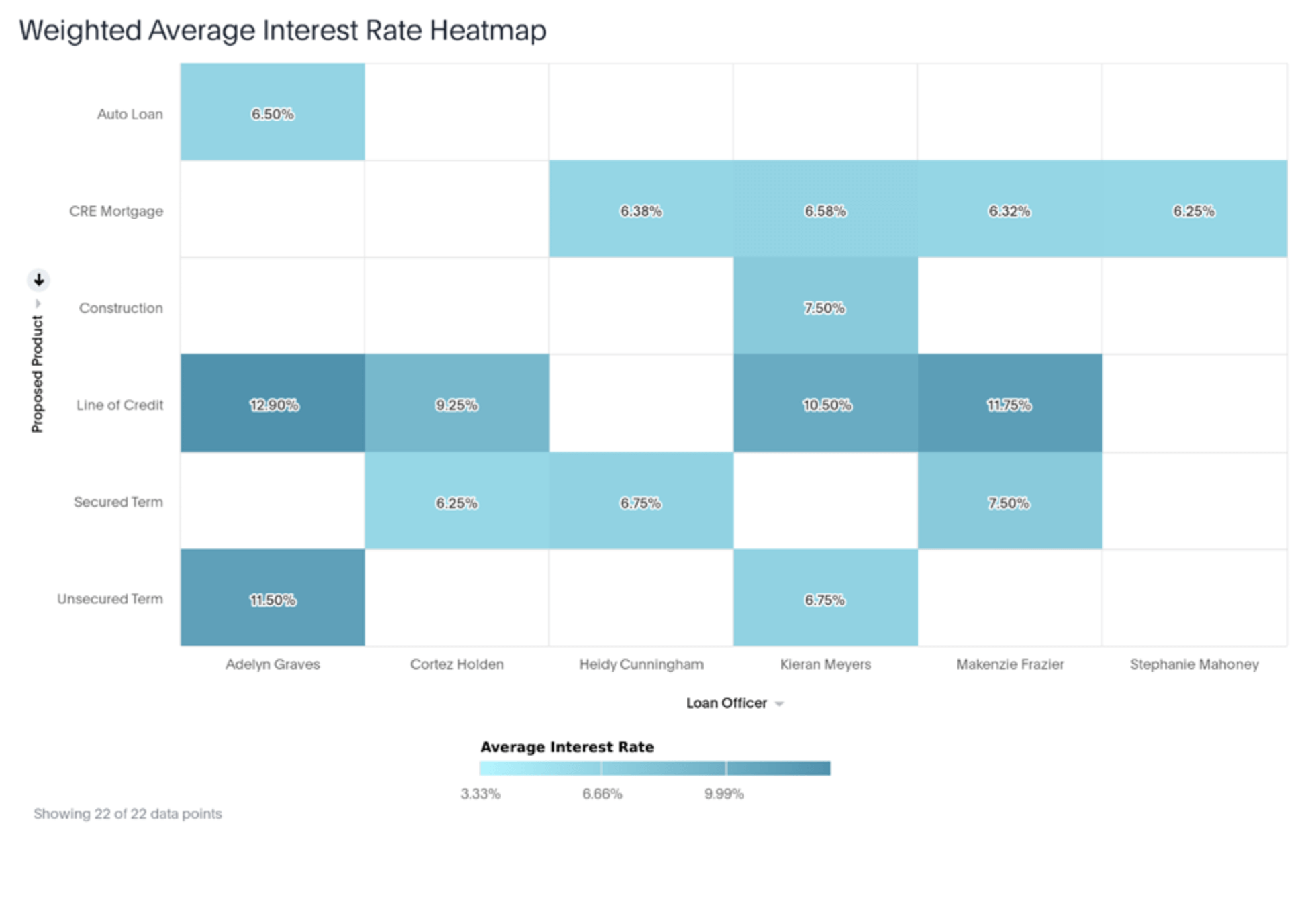
Pipeline analytics – Interest rates

With the rising interest rate environment, it’s as important as ever to generate higher rates on loans to offset margin compression on higher-cost deposits. Reports below show the trending weighted average interest rates on products, within markets (such as state, MSA, etc.), and by loan officer. This type of credit dashboard can help ensure the institution is generating the returns they’re expecting.

graph of interest rates by state to show lending trends

lender dashboard showing interest rates by product

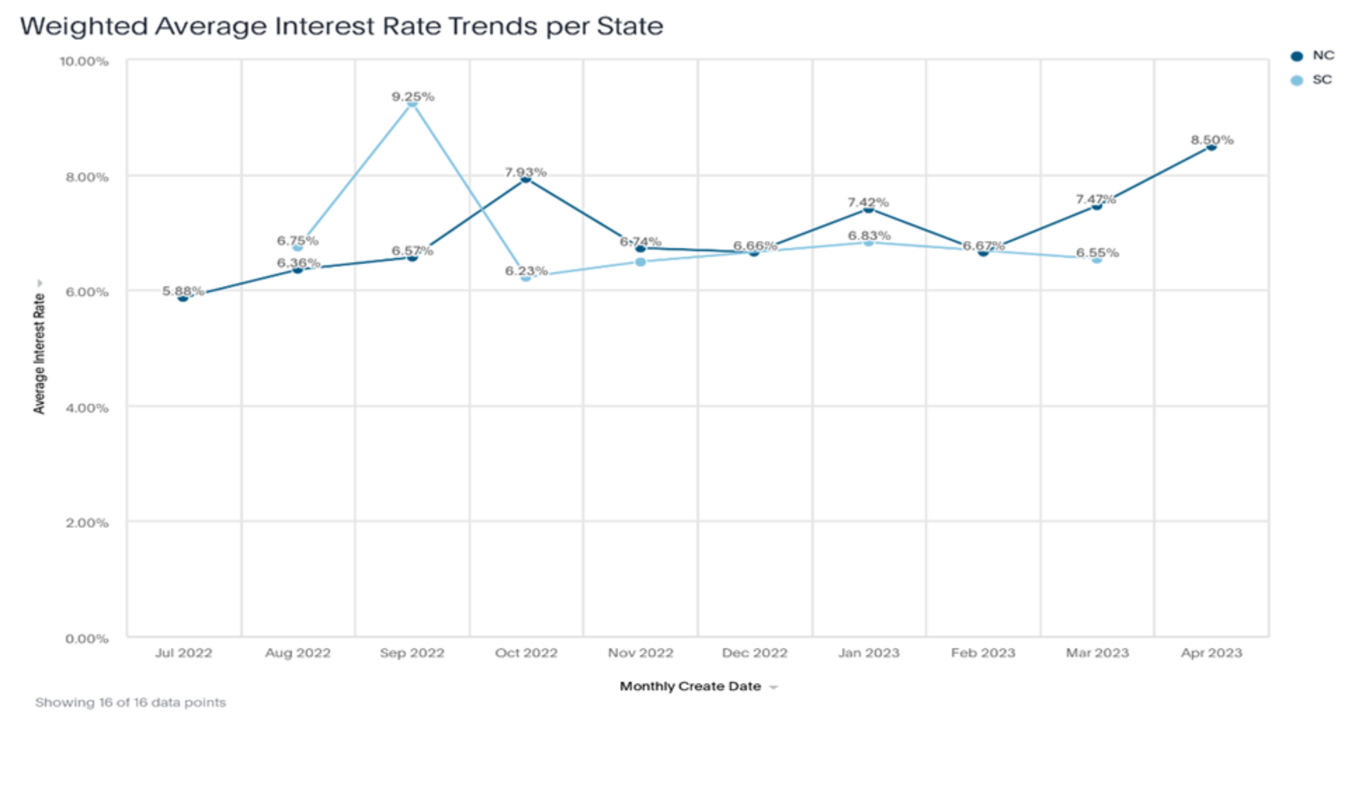
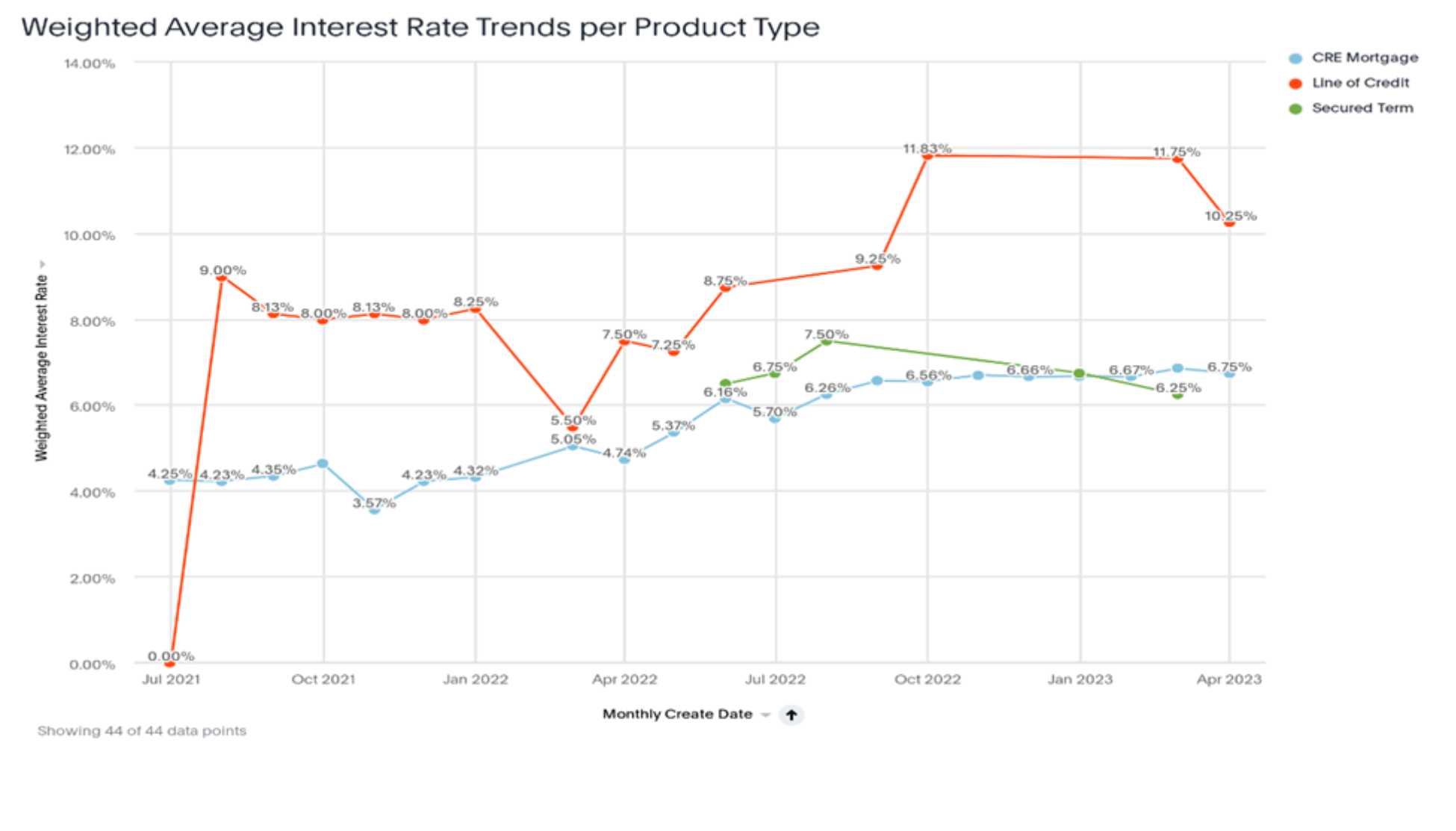
Additionally, keeping tabs on the rates for loans currently in the pipeline can help ensure the institution is generating the returns it’s seeking. Tracking rates for these loans could help identify a trend of price concessions that may be emerging.

heatmap of interest rates on loans

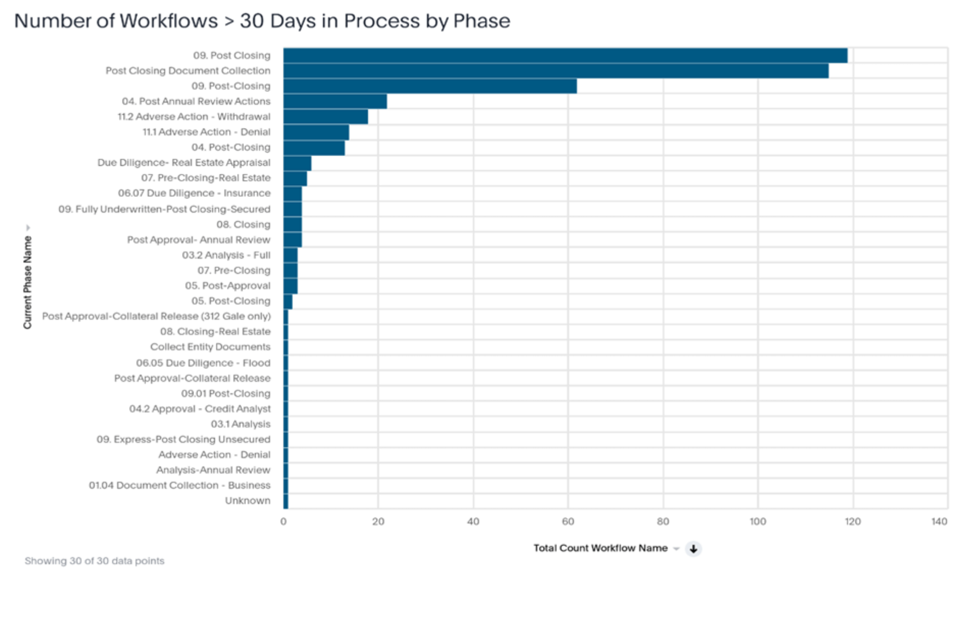
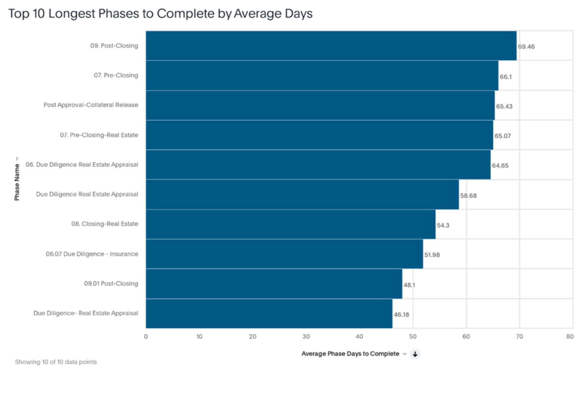
Workflow reports – Bottlenecks

Community financial institutions are acutely aware of their advantages and disadvantages relative to the large banks across the country. One of community institutions’ primary advantages is their ability to provide personalized and targeted customer service. Quick and efficient turnaround is paramount to maintaining this advantage, so leaders need insights on bottlenecks in the process as well as current workflows that may be stuck.

The charts below show the volumes for specific workflows and which actions are taking the longest time. These insights can help leaders determine what is or is not working well in the current loan origination workflow and whether any specific areas need additional attention.

Lender dashboard showing bottlenecks in the loan process

lender dashboard showing how long each part of the loan process is taking

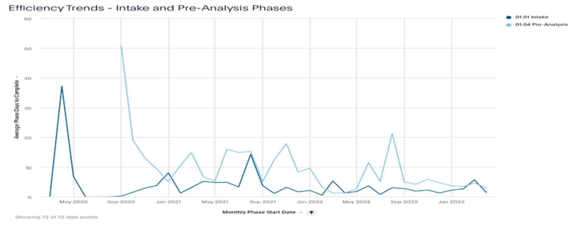
Workflow reports – Efficiency trends

The above visuals are beneficial in determining the current state of an institution’s workflow/process. But it’s also important to track whether the institution is improving in its process over time or whether the process has slowed due to growth, recent volume, or other reasons.

Dashboards isolating key phases or steps in the workflow and tracking efficiency trends can identify whether the institution may need to explore options for more resources or partnering with a vendor to help improve process performance. The charts below are examples of ways to track the efficiency of the intake and pre-analysis phases of loan decisions using monthly trends.

Report for lending leaders on workflow efficiency trends

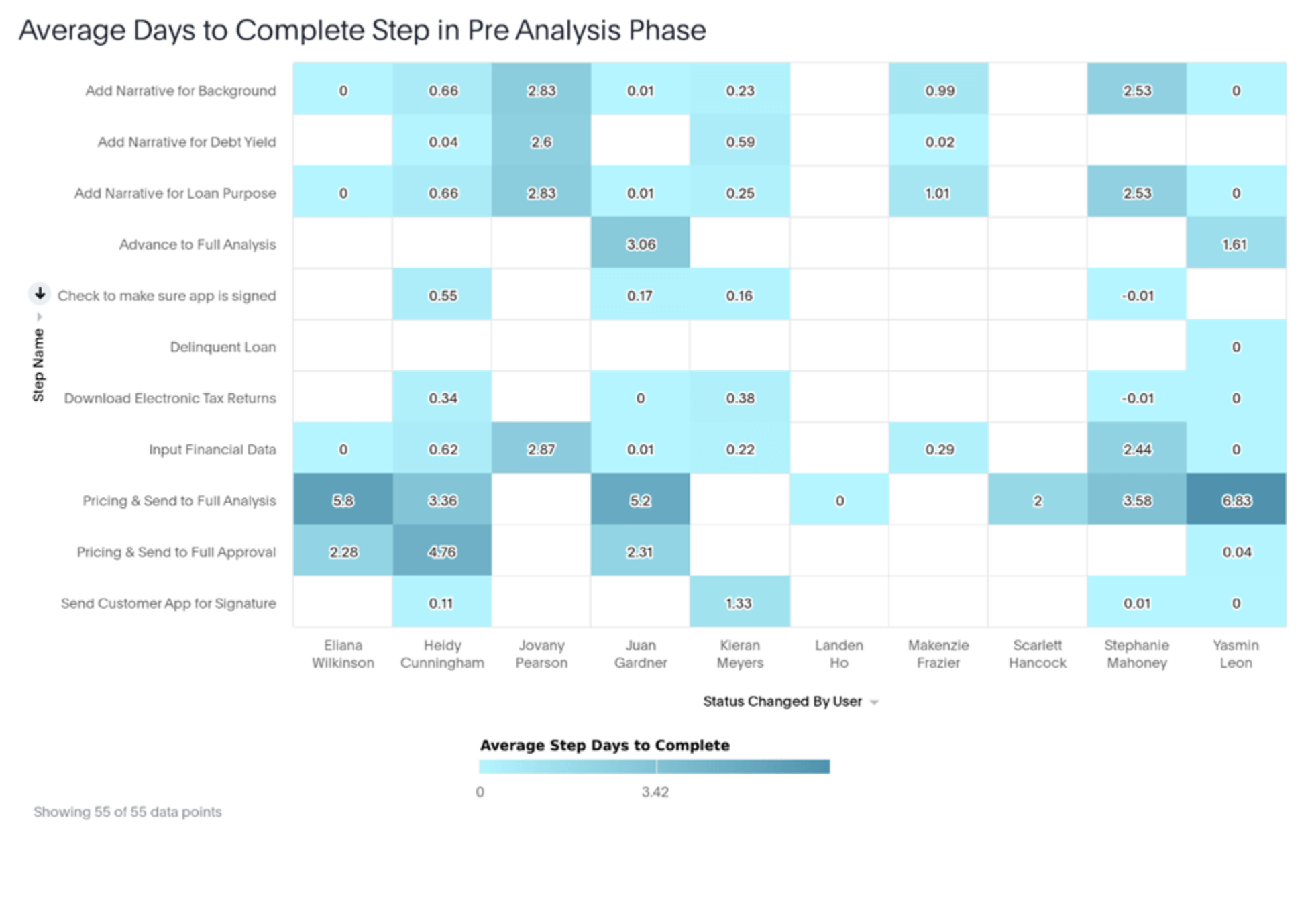
Workflow reports – User efficiency

Processes are good and necessary. But any financial institution — any business really — knows that the execution of those processes is determined by the people behind them.

Banks and credit unions that can break down and determine the efficiencies of their teams and individuals are better able to highlight areas where a team needs more assistance. Performance dashboards can help them more quickly identify whether a particular individual could benefit from additional training or best practices.

Dashboards that isolate key phases of lending and credit and break down steps by employee may highlight those needs across the institution. The chart below shows at a glance how long each team member takes to complete various steps, highlighting those who are working more efficiently and those who are less efficient.

A dashboard for lending leaders to analyze workflow efficiencies by employee

View live dashboards curated for your teams with Abrigo's banking intelligence solution.

Learn more about Abrigo Connect.

About the Author

Zach Langley

Consultant
As an Advisory Consultant on Abrigo’s Advisory Services Team, Zach Langley assists financial institutions in a number of ways, including transitioning to CECL, managing ALM outsource projects, and performing core deposit studies. He has also led Abrigo’s Paycheck Protection Program (PPP) Forgiveness outsourcing and capital planning/stress testing business lines. Zach

Full Bio

About Abrigo

Abrigo enables U.S. financial institutions to support their communities through technology that fights financial crime, grows loans and deposits, and optimizes risk. Abrigo's platform centralizes the institution's data, creates a digital user experience, ensures compliance, and delivers efficiency for scale and profitable growth.

Make Big Things Happen.